
Art for One Drop — Specialty Microsite & Digital Campaign
A multi-channel digital campaign supporting a global charity auction
Overview
Art for One Drop is a philanthropic initiative in partnership with Phillips, raising funds to support clean water access across the globe. For the 2018 New York charity auction, I designed a dedicated microsite and full digital campaign, including:
A specialty sale page microsite
A set of custom infographic icons
A global impact map
A campaign banner with CTA
A long-form editorial feature
Supporting campaign assets: email,
tablet layout, and mobile social post
My Role
Designed all digital campaign elements
within the established One Drop brand systemCreated the full sale page layout and visual direction
Designed the global impact map infographic
Developed custom icons and supporting graphics
Designed the campaign banner and call-to-action modules
Designed the promotional email and tablet layout
Designed the editorial feature article
Prepared all production-ready assets for
developer handoff
Solution
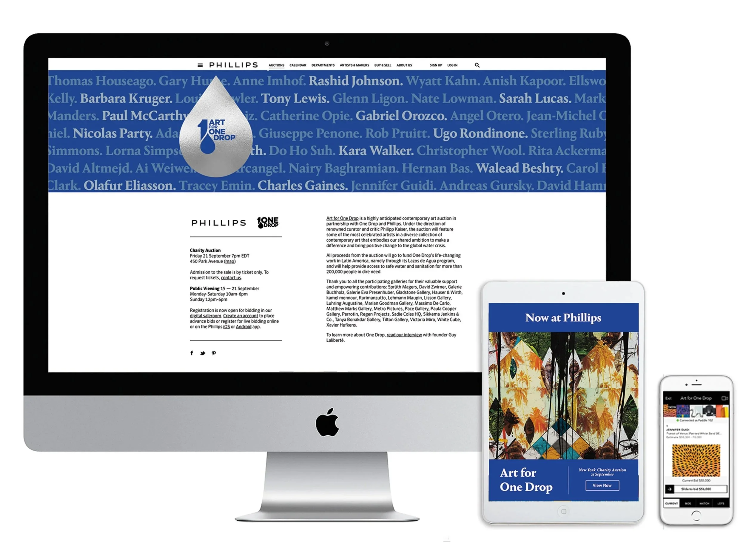
Sale Microsite Design
I designed a fully responsive microsite supported by a cohesive visual campaign across all digital touchpoints.
The core of the experience was a dedicated sale page, built as a standalone microsite that included:
Hero section introducing the campaign
Mission overview and auction details
Participating artist list
Global impact map
Editorial storytelling blocks
Sale highlights and CTA to browse works
Sponsor recognition
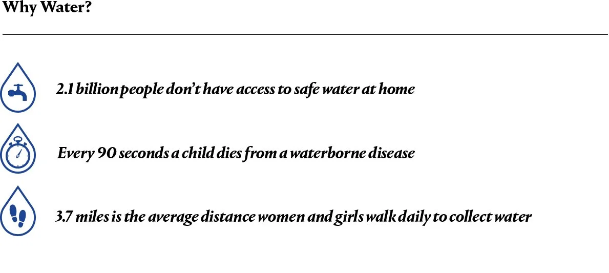
2. Custom Icon Set
I designed a set of clean, water-themed icons to underscore key
facts about global water scarcity:
Access to clean water
Child mortality
Daily walking distances
These icons added clarity and visual
rhythm to essential data points
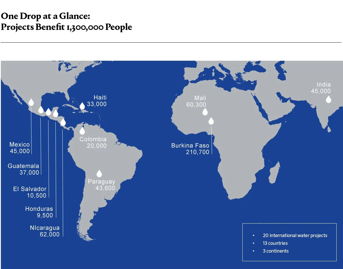
3. Global Impact Map Infographic
A custom global map highlighted the reach of One Drop’s projects across 13 countries and
3 continents. This helped translate abstract numbers into a tangible geographic story.

4. Campaign Banner With CTA
I created a full-width color banner featuring artwork from the sale with a clear, high-contrast CTA: Browse Sale.
This banner was used throughout the microsite and repurposed for email and social media.

Final Outcome
Impact
Delivered a clear, elevated digital experience for a major philanthropic partnership
Helped communicate complex global data in simple visual form
Provided a unified campaign across web, email, and social
Enhanced visibility for participating artists and supported the fundraising mission
The campaign extended beyond the microsite:
Sale page in situ (desktop)
Campaign email (tablet version shown)
Mobile social post promoting the auction
Editorial Article read here
Each asset was designed to reinforce the same visual language — blue palette, water imagery, clean typography, and CTA hierarchy — ensuring a cohesive campaign across platforms.
What I Learned
Designing a cause-based microsite requires clarity and empathy. Balancing storytelling, data visualization, and auction logistics taught me to simplify complex information while retaining brand sophistication.
What I’d Improve Next
If revisiting the project, I’d explore interactive elements for the global map and integrate more motion to strengthen the emotional connection behind the cause.