Phillips Editorial Hub —UX/UI Case Study
A unified digital editorial experience for an international auction house
Full responsive UI design (desktop → mobile)
Interaction patterns & behavior
Visual & art direction within the Phillips brand
Developer-ready specifications & handoff
Overview
Phillips lacked a centralized editorial destination. After the Content Director set the vision, I created the UX architecture, UI system, and responsive design that shaped the new Editorial Hub.
My Role
UX architecture & user flows
Low- and high-fidelity wireframes
Component system design (filters, cards, pagination, etc.)
Design Goals ✓
Centralize content – Bring articles, videos, and interviews into one unified hub.
Boost discoverability – Add filters, categories, and sorting for easier browsing.
Clarify hierarchy – Establish hero → secondary → curated → archive flow.
Reflect brand – Use minimalist, elegant typography and spacious layouts.
Design mobile-first – Create an intuitive, premium experience across devices.
Process
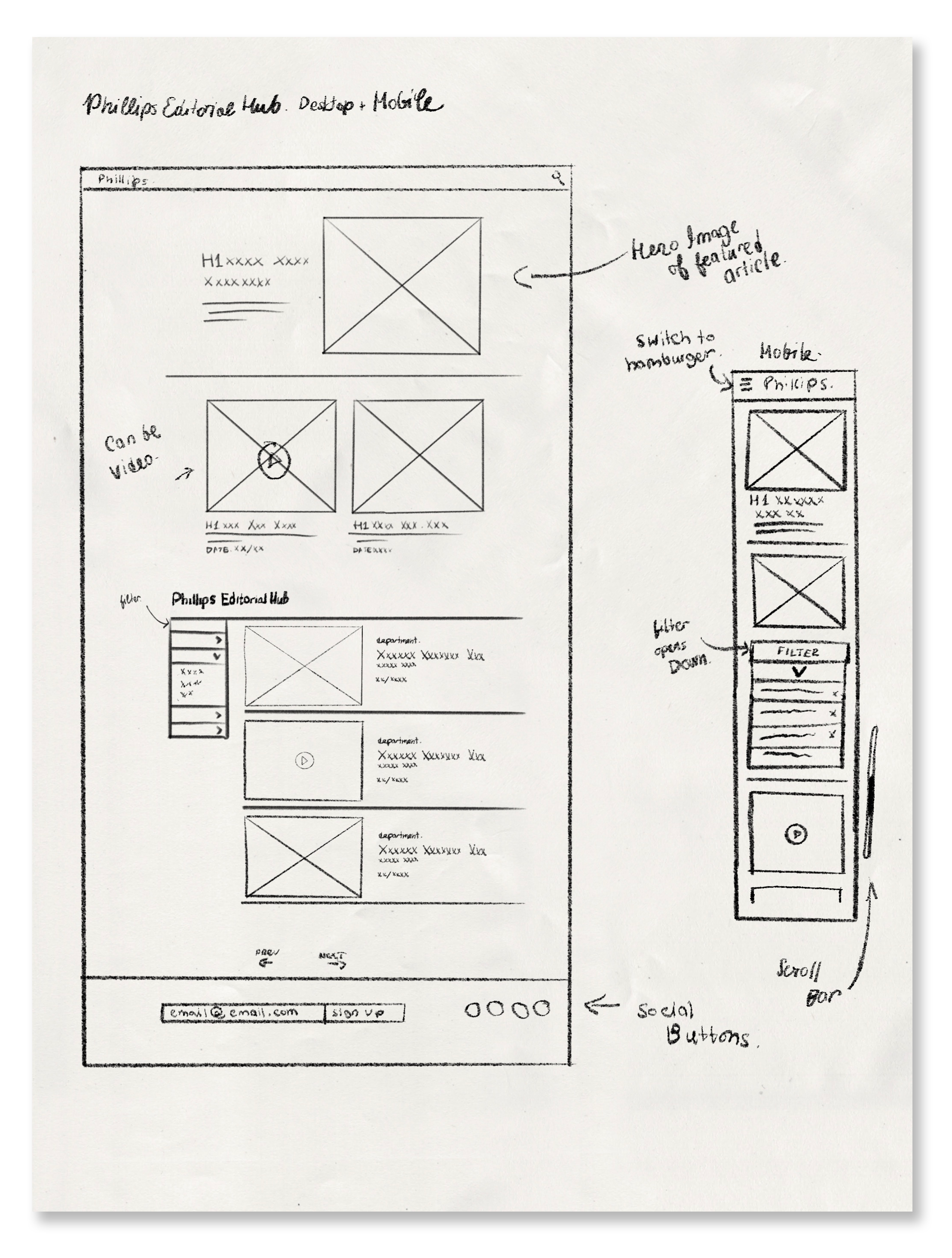
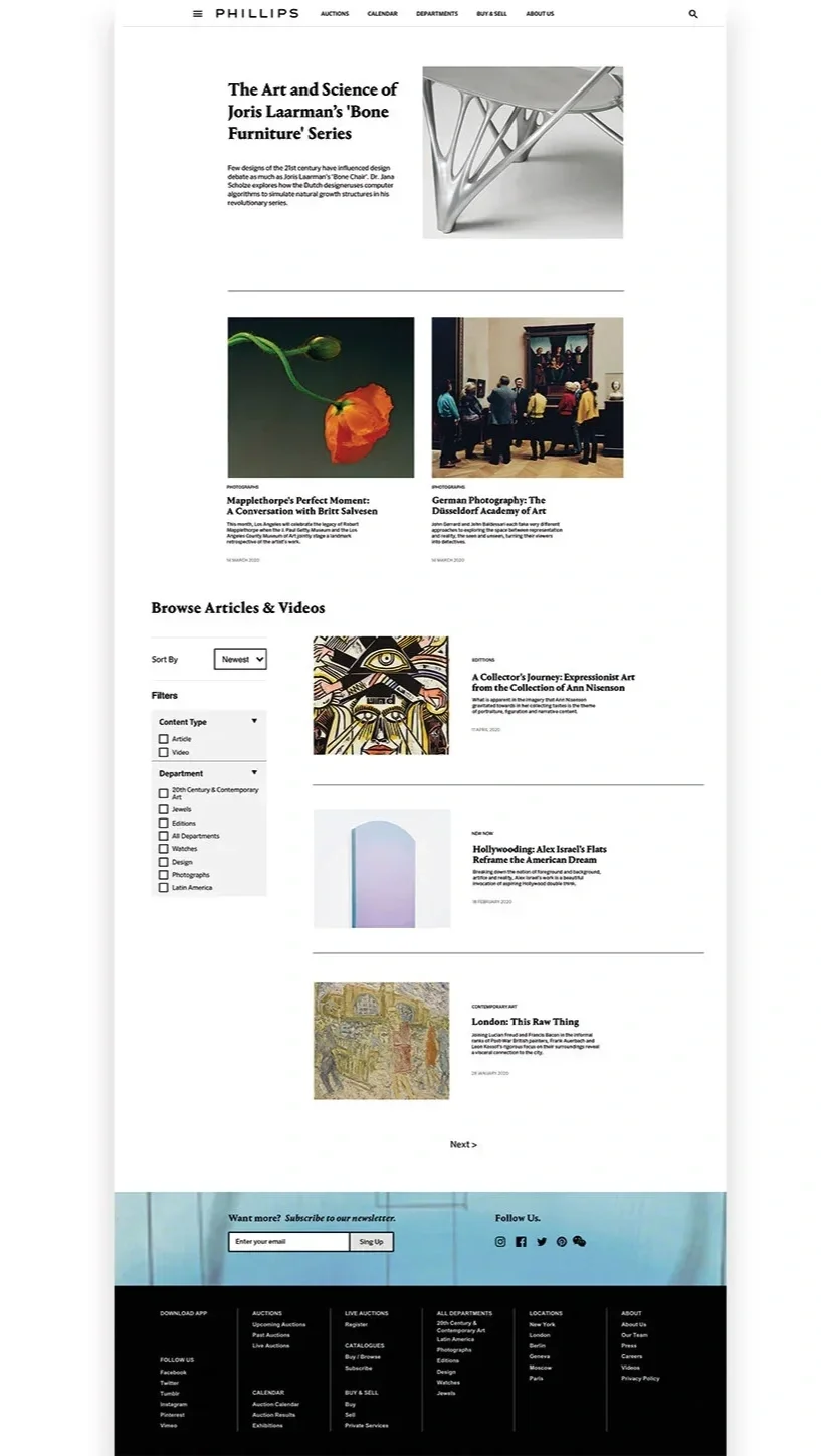
1. Low-Fidelity Wireframes: Structure First
I began with hand-drawn wireframes to quickly explore content hierarchy:
Key decisions made at this stage
Hero story receives a full-width, left-text/right-image layout
Two secondary stories appear directly below the hero
A persistent filter panel sits on the left (drawer on mobile)
A scannable archive grid for long-term browsing
Pagination and newsletter sign-up anchor the bottom
2. Translating Structure Into
High-Fidelity Comps
Using Phillips’ established brand guidelines,
I developed a sleek high-fidelity design that
balanced minimalism with editorial richness.
Notable design decisions:
Restrained neutral color palette
Crisp editorial typography (inspired by modern art publications)
High white-space ratio to reflect gallery ambiance
Clean edge-to-edge imagery to mirror auction catalog layouts
Filter, Sorting, and Discovery System
Because this Hub was created from scratch,
I defined Phillips’ editorial taxonomy:
Department Filters
Contemporary Art
Design
Editions
Photography
Jewels
Content Types
Articles
Videos
Interviews
Features
Sorting Options
Newest
Oldest
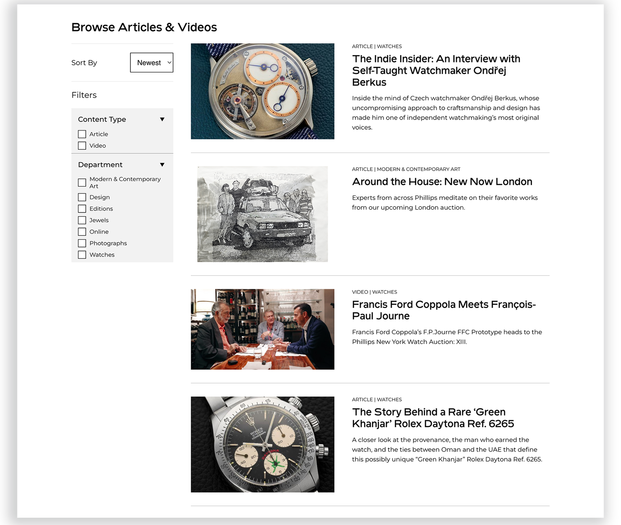
This filtering system transformed passive browsing into guided exploration.
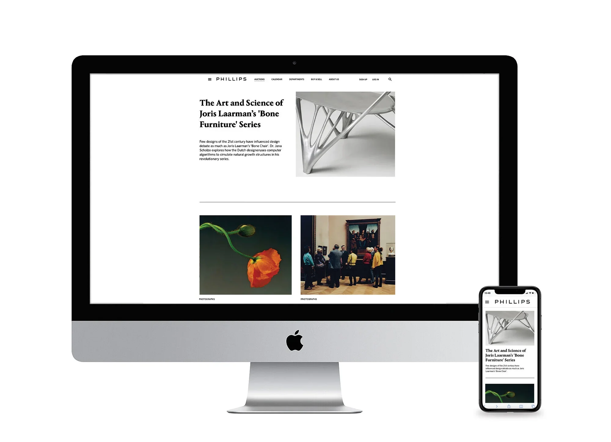
3. Responsive Design & Mobile Navigation
The mobile version restructured the
experience into a stacked, scroll-first layout:
Mobile innovations:
Hamburger navigation
Accordion-style filters
Vertical hero card
Swipable media
Scroll-friendly spacing
Video content marked with intuitive overlays
The mobile version maintains the brand’s refined feel
while being optimized for smaller screens.
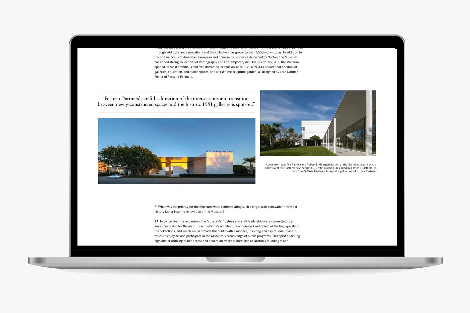
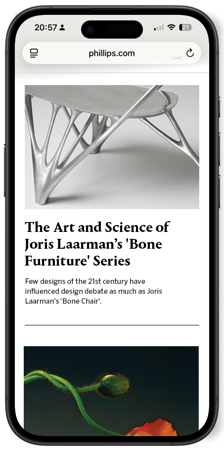
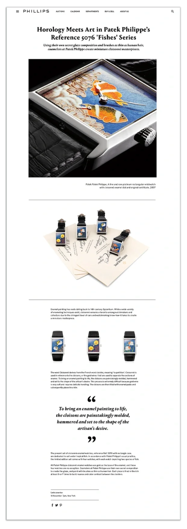
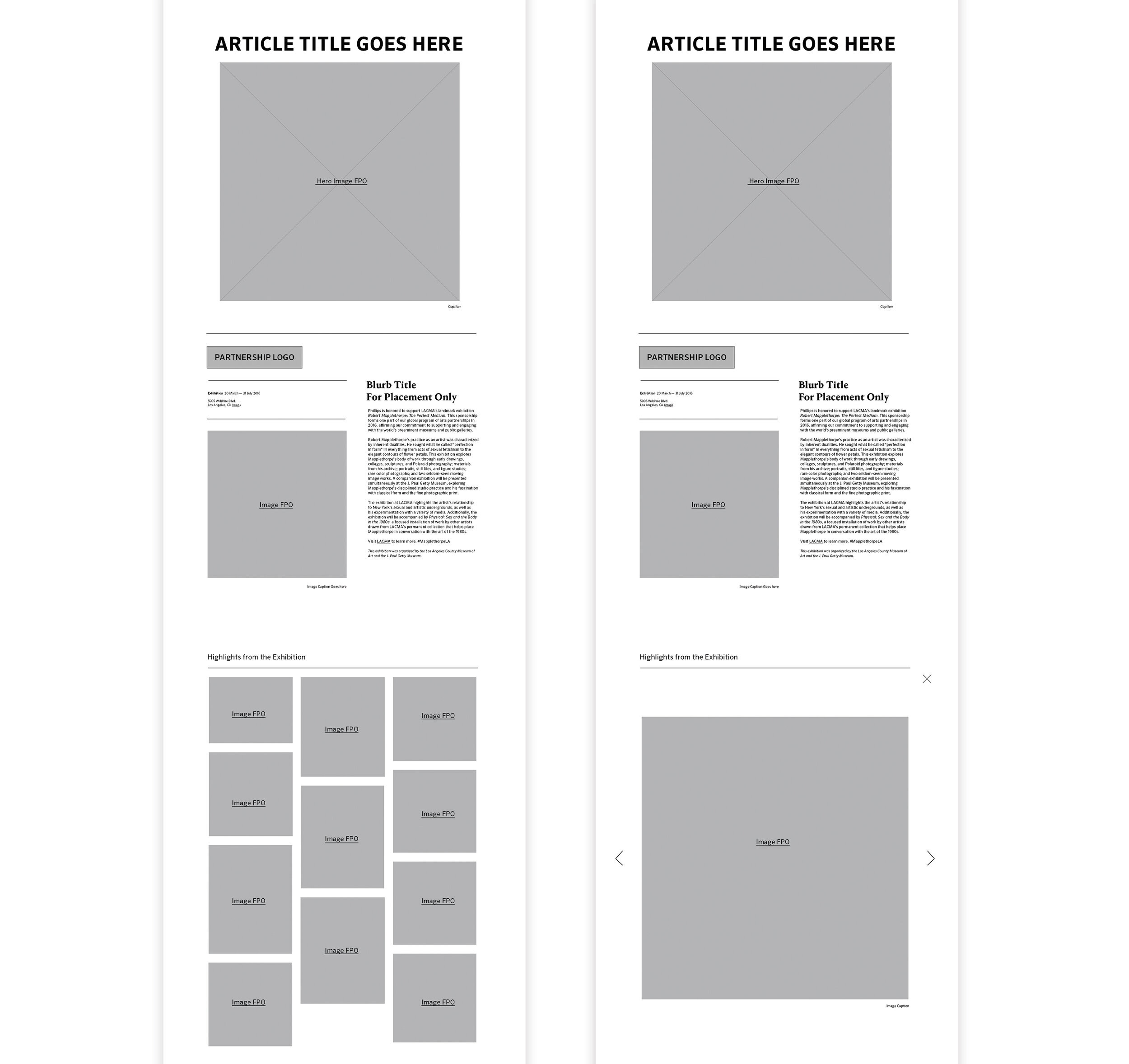
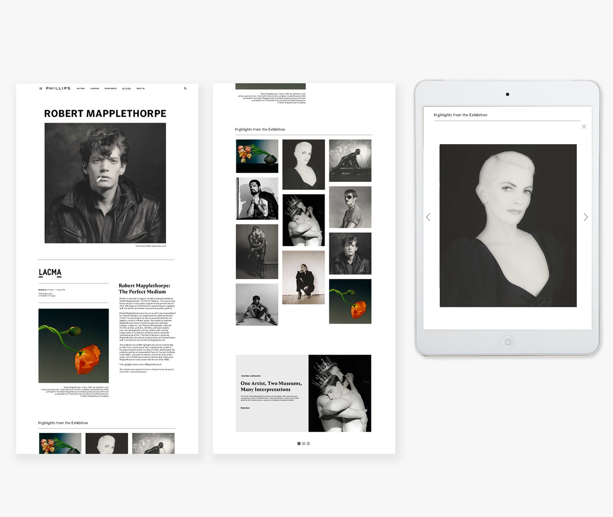
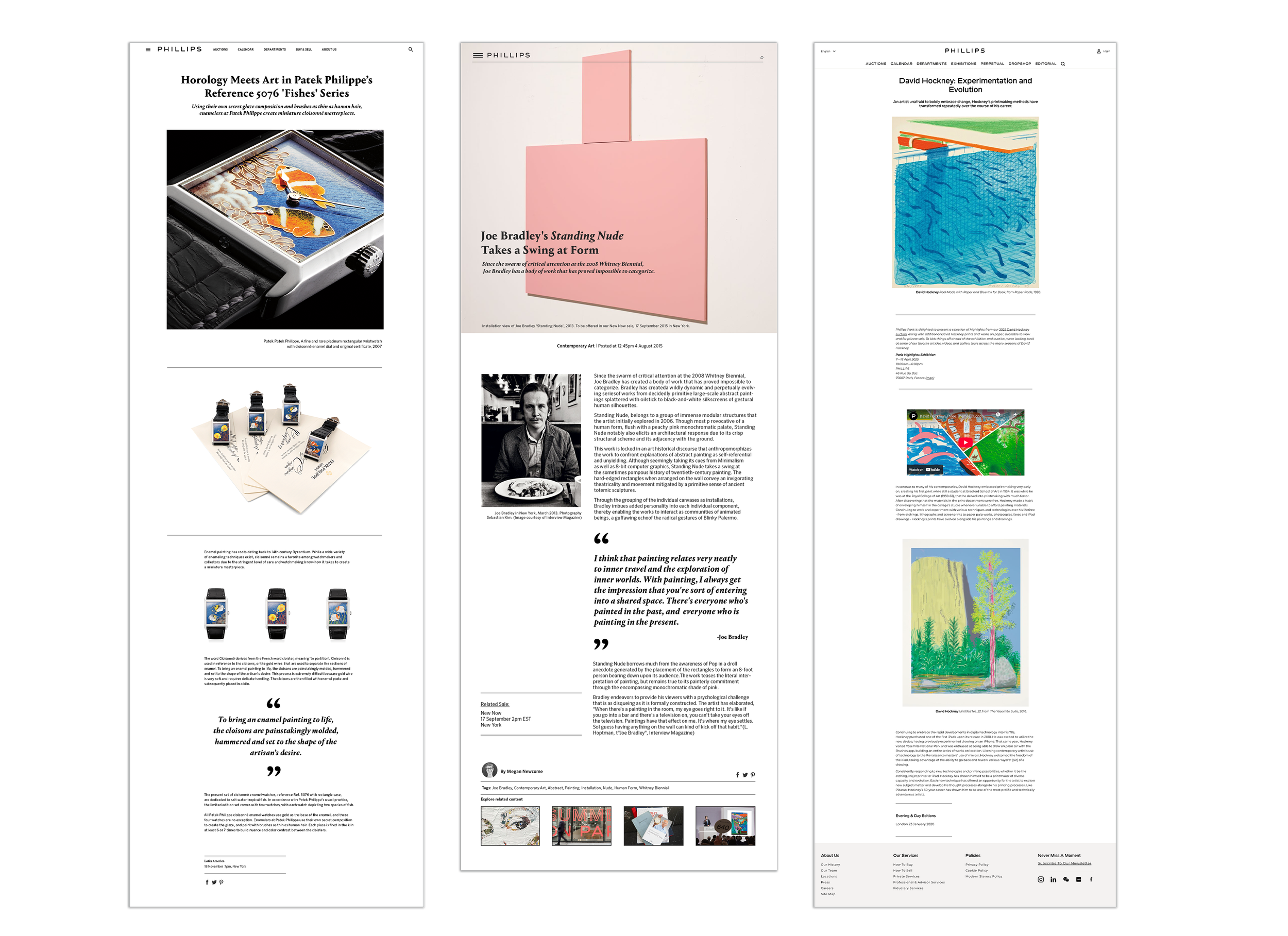
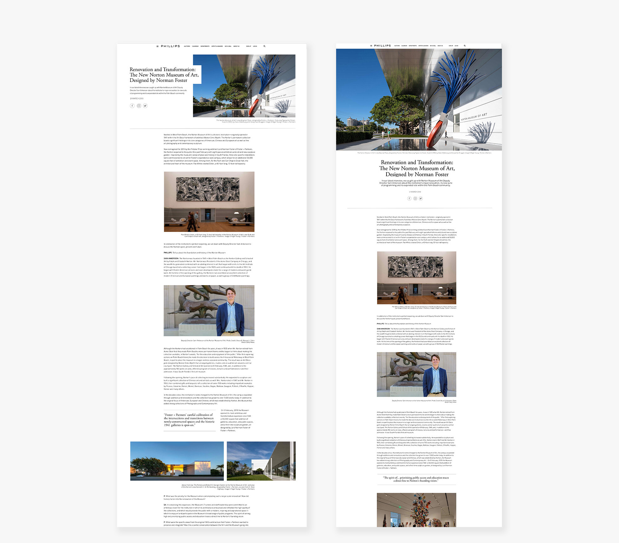
4. Modular Design system implementation
I designed the editorial pages using a modular system — a set of reusable layouts and card patterns that flex for articles, videos, interviews, and image-heavy features. This system allowed the team to build varied editorial pieces quickly while maintaining visual consistency and brand alignment.
See examples below


Final Outcome
The Editorial Hub:
Centralized all editorial content for the first time
Significantly increased discoverability and cross-department visibility
Provided a consistent foundation
for future storytellingStreamlined content publishing
for Phillips' internal teamsReinforced Phillips’ brand identity through a cohesive digital
editorial style
Impact
✔ First-ever centralized editorial experience
This hub didn’t exist before — I designed it end-to-end.
✔ Increased user engagement
Clear hierarchy and filtering encouraged deeper exploration.
✔ Elevated brand storytelling
The new system aligned online editorial with Phillips’ gallery-level curation.
✔ Scalable for years to come
Flexible modules empower the team to continue expanding content.
What I Learned
Designing the hub from scratch reinforced the importance of building flexible systems rather than one-off pages. Close collaboration with content stakeholders also helped ensure the UX supported real editorial workflows.
What I’d Improve Next
If revisiting this project, I’d further refine the taxonomy and explore more dynamic components for long-form storytelling.