
Lucky Mobile —
UX / UI E-Commerce
Experience
A Figma Certification Class Project
Skills Used
UI design for mobile & desktop
Responsive layouts and visual hierarchy
Component + style system creation in Figma
Interactive prototyping
Checkout & e-commerce flow design
Iconography and micro-interactions
Overview
Lucky Mobile is a fictional premium smartphone brand created for my Figma certification. I designed a full mobile and desktop e-commerce flow — from homepage to checkout — showcasing end-to-end UX thinking, responsive UI, and a scalable component system.
User Persona


Marlene

NYC

Mid- 30’s

Manages a large team
Highly scheduled and efficiency-driven
Has never purchased anything similar before
Needs clarity, speed, and reassurance throughout the buying flow
This persona informed the overall tone: simplified decision-making, clear hierarchy, and guided checkout interactions.
Process
I explored visual references across tech, fintech, and modern consumer product design. Themes included:
Soft gradients & tech-forward palettes
Clean geometric layouts
Premium device photography
Calm but elevated UX patterns
This helped set the tone for Lucky Mobile’s
visual identity and brand feel.
1. Moodboards & Direction


2. Low-Fidelity Wireframes
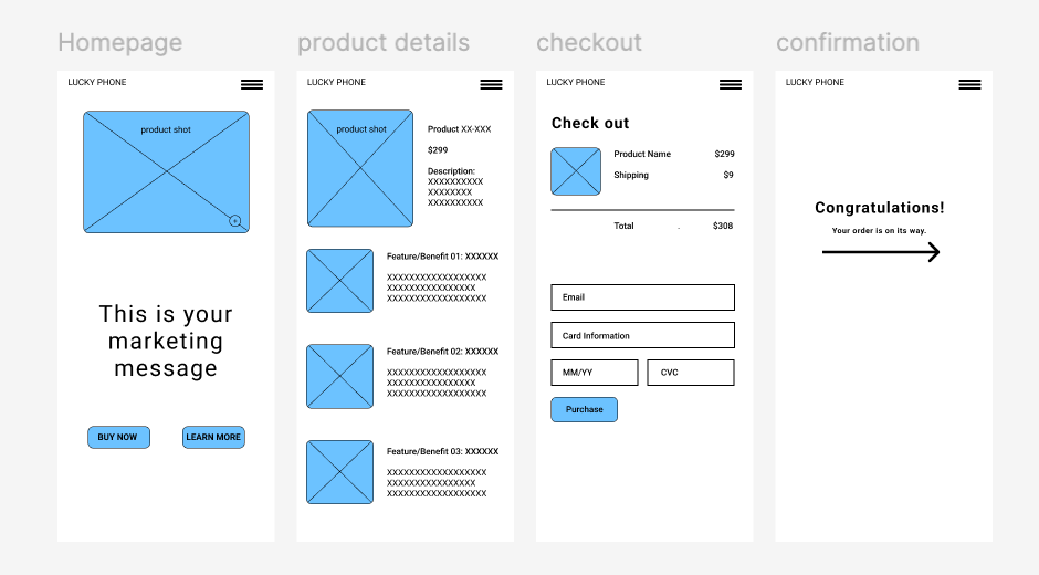
I mapped and prototyped the full user flow in low-fi:
Homepage
Product Details
Checkout
Order Confirmation
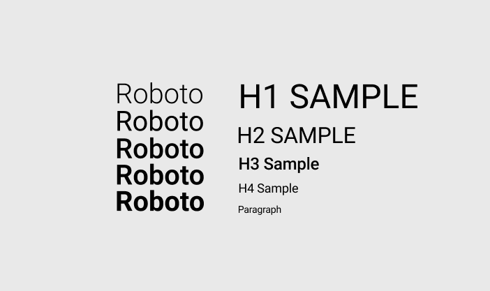
3. Style Guide Development
I defined:
Typography scale
Two color palette directions (cool-tech and warm-tech)
Spacing system
Button + icon treatments
This ensured consistency across all pages and provided a reference for the component library.
The goal was to validate structure, content hierarchy, and interaction logic before adding polish.
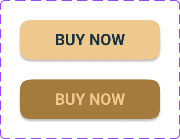
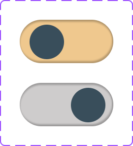
4. Component Library
I built a reusable set of components, including:
Buttons (primary, secondary, alt)
Nav bars (mobile + desktop)
Cards
Toggles and form fields
Checkout UI elements
Product preview modules
Tooltip patterns
This allowed fast assembly of responsive screens with consistent behavior.


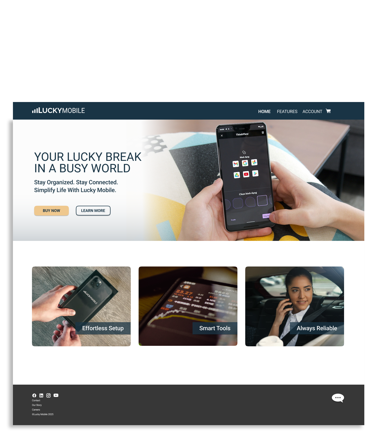
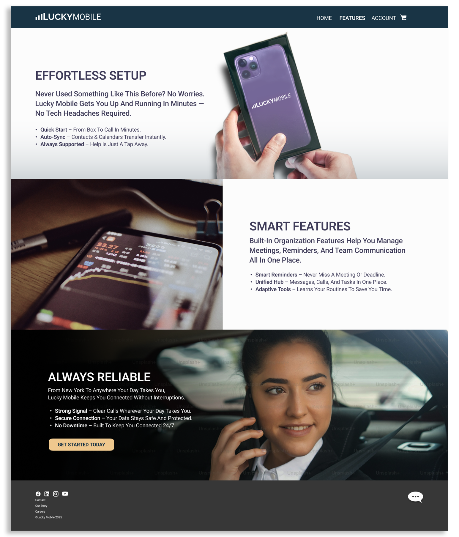
5. High-Fidelity Screens
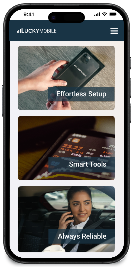
I designed the full experience in mobile and desktop:
Homepage with product intro, feature cards, and CTAs
Product Details with imagery, feature breakdowns, and marketing copy
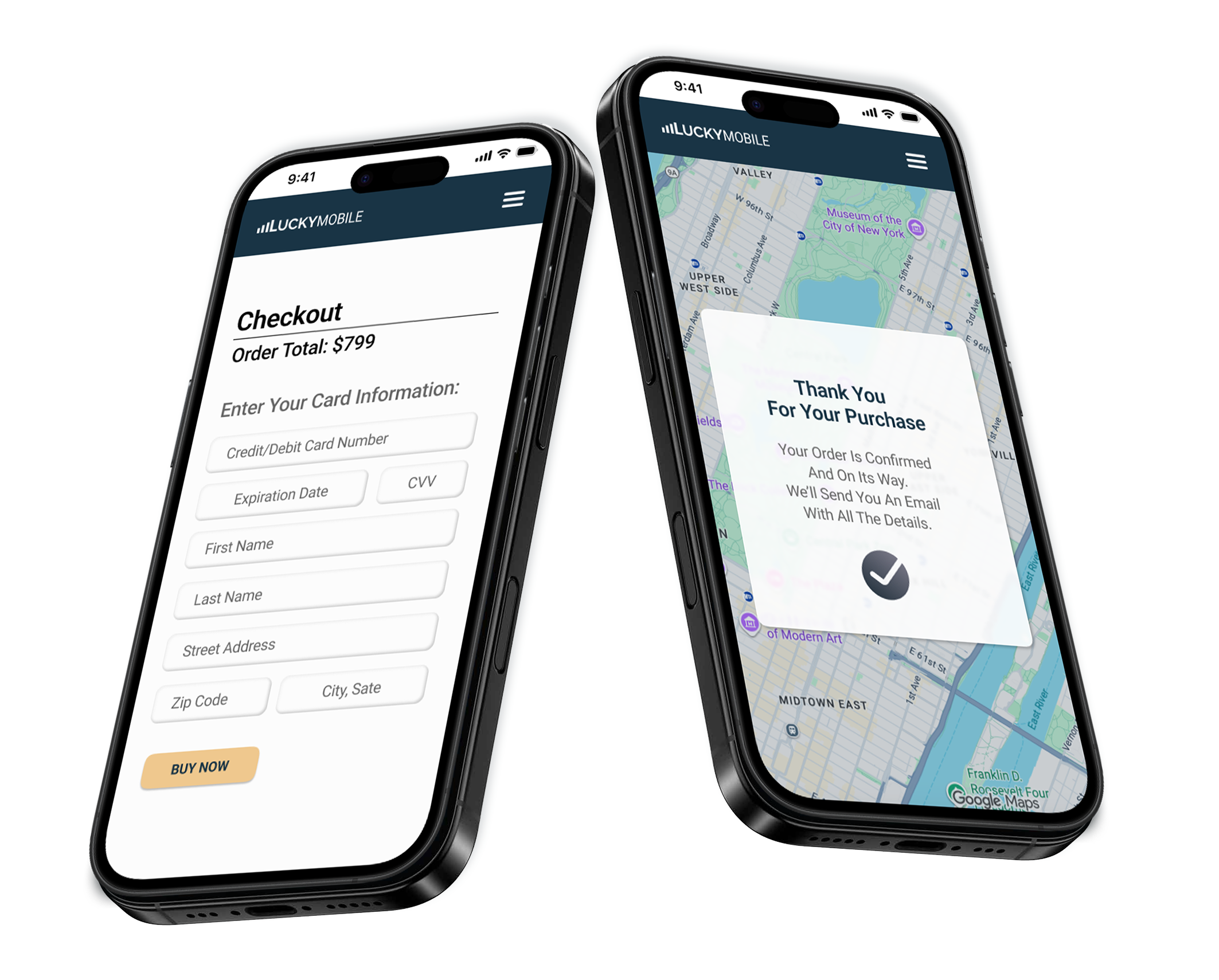
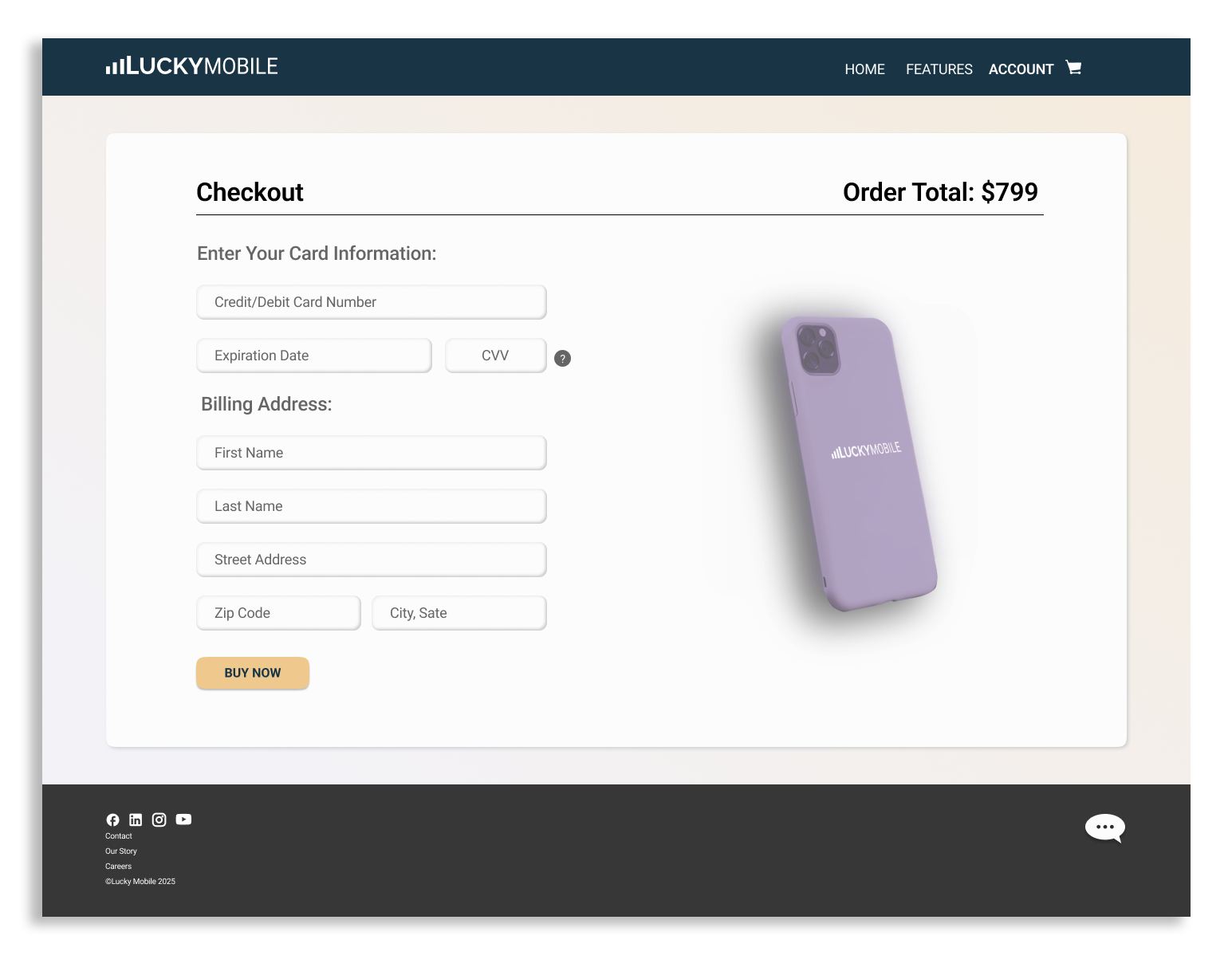
Checkout with step-by-step form, tooltips, and purchase CTA
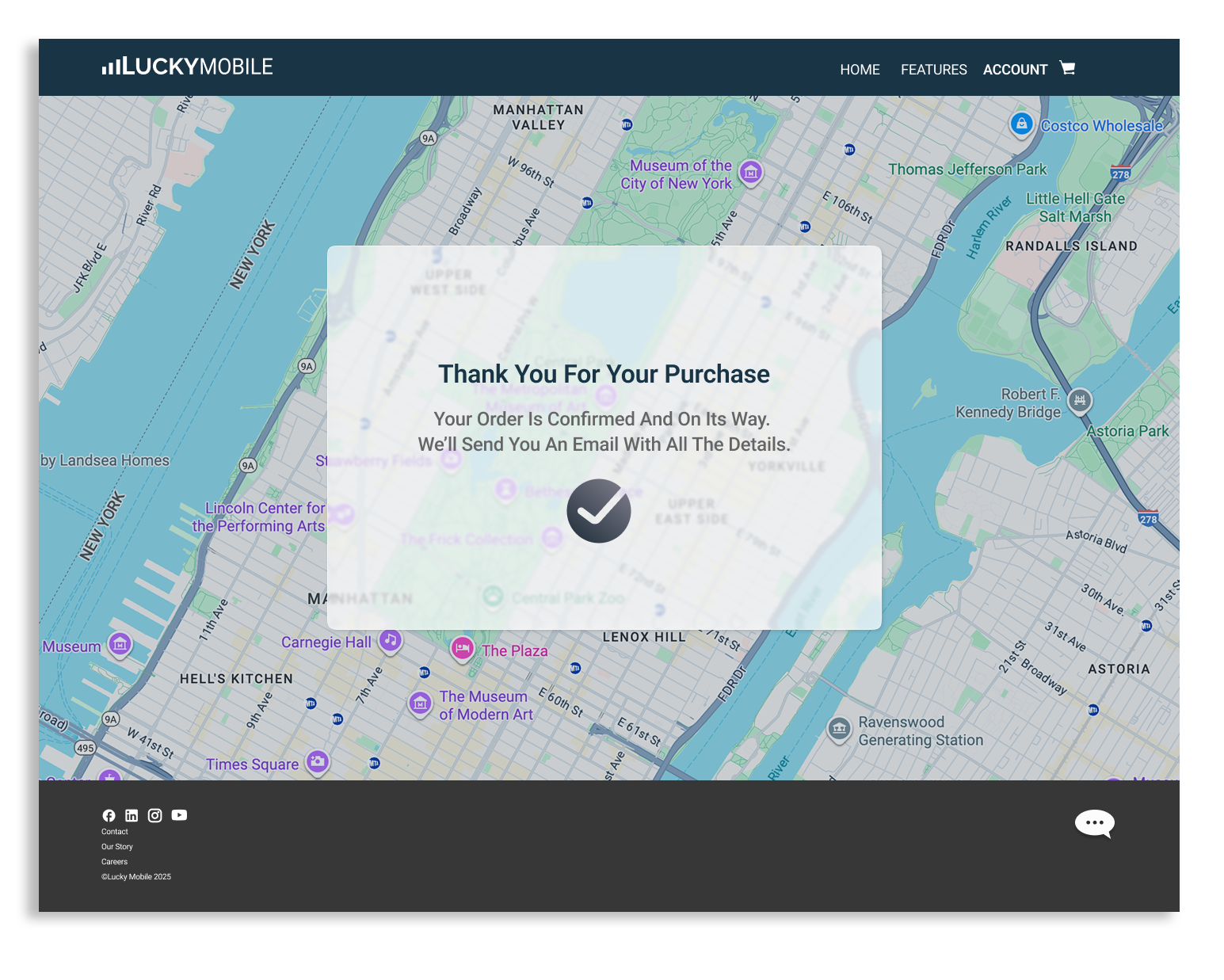
Confirmation Page using a map overlay to reinforce delivery transparency
The UI balances warmth (photography, soft shadows) with functional clarity.

Play video to view the working prototype screen recording in Figma
What I Learned
Building a project from scratch with no existing brand pushed me to:
Define a clean design system early so every decision later was faster
Balance marketing storytelling with streamlined checkout UX
Use component libraries to scale responsive designs efficiently
Next Steps (If This Were Real)
Expand the system to include product comparison pages
Add an “account dashboard” framework
Introduce animations for loading, adding to cart, and confirmation
Conduct usability testing to refine checkout clarity